

LEARNING OBJECTIVES
-
Be able to produce summary statistics and assess normality
-
Be able to perform the appropriate statistical tests by looking at the type of data and the number of samples to compare
-
Be able to assess the association between two or more variables, identify confounders, make predictions and reduce the dimensionality of data
This article provides the fundamental statistical elements any researcher should bear in mind when conducting a statistical analysis of an experiment. Whether this is an observational study or a clinical trial, a researcher should be able to form a research question for addressing a clinical problem. This involves (a) identifying the population of interest, (b) specifying the exposure or intervention under investigation and the comparison exposure or treatment and (c) defining the outcome of primary interest. The role of statistical analysis during this process is of vital importance, not only from a scientific perspective but also from the ethical point of view. For instance, if the investigator wants to prove that a small effect size is statistically significant, it would not be ethical to conduct a study with a small sample size. Moreover, for valid inferences to be drawn, the statistical analysis should be made according to the types of data and the research question under investigation. It is therefore important for the clinician to be able to understand the basic principles of choosing an appropriate statistical test for testing a hypothesis and reporting the results.
Types of data
Before moving onto any kind of statistical analysis, it is important to understand the distinction between three main categories of data: these will determine the most appropriate statistical test. They are (a) continuous, (b) categorical and (c) time-to-event data.
Continuous data can be derived by adding, subtracting, multiplying and dividing. Examples of this kind of data include age, body mass index (BMI) and General Health Questionnaire (GHQ) score. Moreover, continuous data can be extended to count data such as number of epileptic episodes.
Categorical data can be: (a) binary, i.e. data with two categories, such as dead or alive, treatment or control, disease or non-disease; (b) nominal, i.e. data with categories that cannot be ordered, such as blood type, marital status or occupation; or (c) ordinal, i.e. data with ordered categories, such as school grades, age categories (e.g. 25–35, 35–45, etc.) and ratings on a Likert scale (e.g. strongly agree, agree, disagree, etc.).
Time-to-event data measure the time it takes for an event to occur, such as time to death or time to remission.
This article focuses on the analysis of continuous data.
Summary or descriptive statistics
The first step of any statistical analysis is to describe the population of interest. This will give information about patients’ demographic and clinical characteristics, such as age, gender and educational status. The best way of doing this is to produce summary statistics.
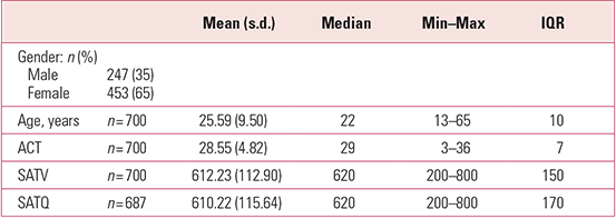
Table 1 shows the summary statistics produced on three measures of ability collected as part of the Synthetic Aperture Personality Assessment (SAPA) project (http://sapa-project.org). These are: the self-assessment SATFootnote a Verbal (SATV) score, the self-assessment SAT Quantitative (SATQ) score and the Assessment Composite Test (ACT) score (Reference Revelle, Wilt, Rosenthal, Gruszka, Matthews and SzymuraRevelle 2010). As can be seen from Table 1, gender (a binary categorical variable) is summarised as frequencies (n) and percentage proportions (%), whereas continuous variables such as age, ACT, SATV and SATQ scores are summarised by the mean, along with the standard deviation (s.d.) and/or the median, minimum (min) and maximum (max) and interquartile range (IQR).
TABLE 1 Summary statistics from the Synthetic Aperture Personality Assessment (SAPA) project
Means, medians, standard deviations and interquartile ranges
The mean value corresponds to the average value of a continuous variable, whereas the median corresponds to the exact middle value of its distribution. That is, if we rank all patients from youngest to oldest, the median value will be the one in the middle of this ranking. This is possible when we have an odd number of observations. If there is an even number of observations, the median is derived as the average of the two values in the middle of the distribution.
In some cases, the median is reported instead of the mean. The reason for this is that the latter is influenced by extreme values (outliers), which are very large or very small values. An example is shown in Fig. 1, where there are many individuals of an older age that push the value of the mean to the right of the distribution. In this case, the mean value is greater than the median and we say that the distribution is skewed to the right (it has a right tail). If the mean was smaller than the median, we would say that the distribution is skewed to the left (it would have a left tail).
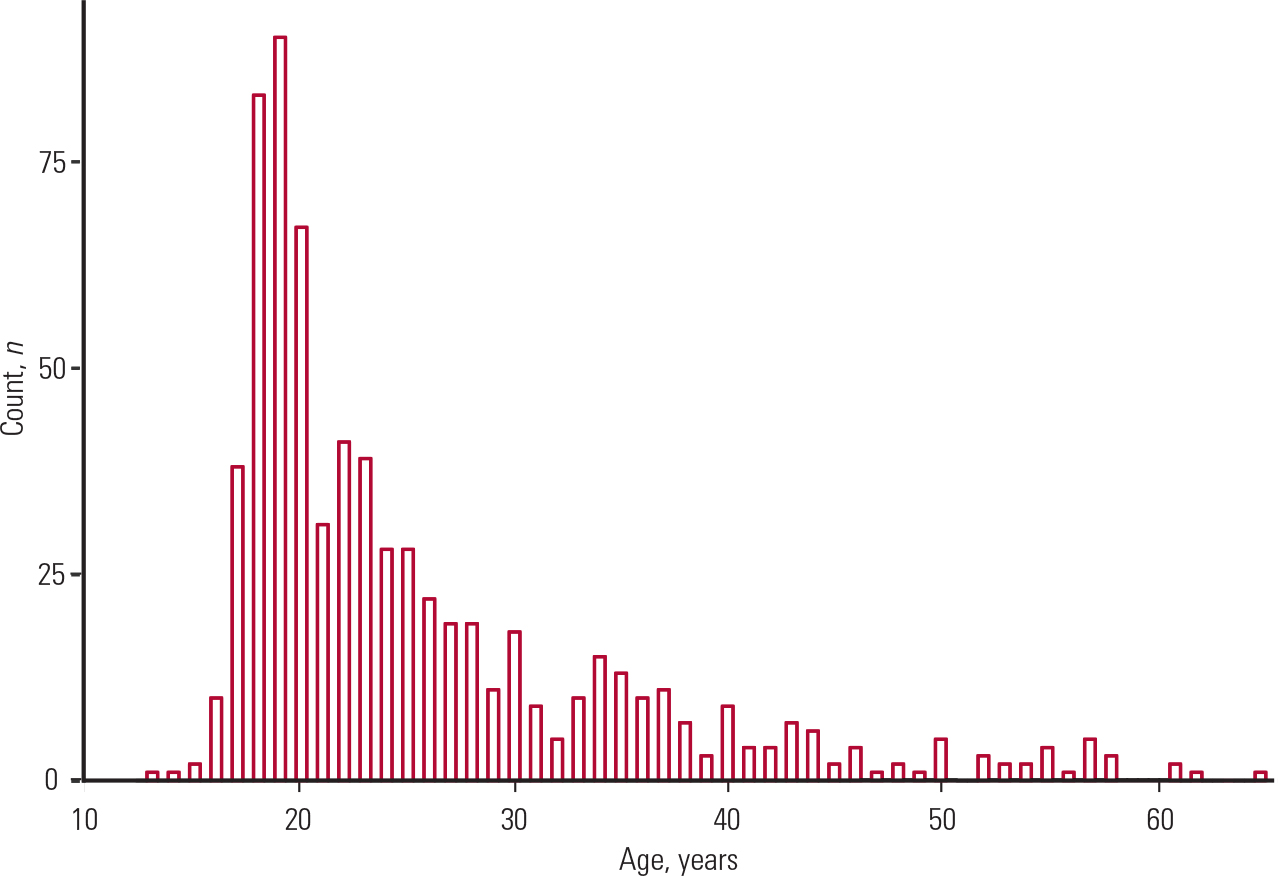
FIG. 1 Histogram showing the age distribution of participants summarised in Table 1.
Similar to the mean, the standard deviation is also influenced by extreme values. The standard deviation measures the variability of a trait. So, in cases where our distribution is skewed, it is better to report the IQR instead of the standard deviation.
The IQR is the difference between the 1st and 3rd quartiles of the distribution. The 1st quartile corresponds to the value for which 25% of the observations are lower, and the 3rd quartile is the value for which 75% of the observations are lower. These values will be the same regardless of how low or high the minimum and maximum values are. Hence, the IQR is not affected by outliers.
Normality of data
If a variable is distributed symmetrically around its mean (i.e. the plotted distribution is bell-shaped), then this variable is said to follow a normal distribution. Hence, using a histogram is one way of assessing the normality of a variable.
Another way of assessing normality is by using a box plot (Fig. 2). The box plot consists of the median value (the horizontal line inside the box); the 1st and 3rd quartiles of the distribution are the lower and upper edges of the box respectively, and the minimum and maximum values of the distribution are the upper and lower ends of the plot respectively. The red dots outside the boxes are the outliers of the distribution. If the median is located in the middle of the box and the spread of the distribution is symmetrical around the median, then this is an indication of a normal distribution.
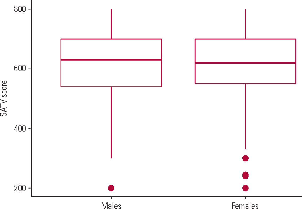
FIG. 2 Distribution of mean SAT Verbal (SATV) scores over males and females (data from Table 1).
A third way to assess normality is by a normal probability plot. If this is linear then the normality assumption is satisfied. In our case (Fig. 3) it is far from linear, which confirms our conclusion (from Fig. 1) that age was non-normally distributed.
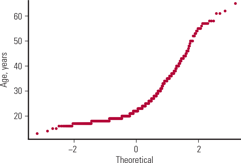
FIG. 3 Normal probability plot for age (data from Table 1).
There are also formal tests for assessing normality, such as the Kolmogorov–Smirnov test. These tests test the null hypothesis that the distribution is normal, hence small P-values (described in the next section) suggest strong evidence against normality. Such tests, however, should not be trusted much because they are influenced by the sample size. For instance, a small sample may fail to reject a hypothesis of normality, whereas a very large sample may falsely reject a hypothesis of normality.
Box 1 gives key points on summary statistics.
BOX 1 Summary or descriptive statistics
-
Summary statistics are used to describe the population of interest
-
The mean and standard deviation (s.d.) are reported for continuous variables whose distribution is not skewed
-
The median, interquartile range (IQR), minimum and maximum values are reported for continuous variables whose distribution is skewed
-
Frequencies and percentage proportions are reported for categorical variables
-
Histograms, box plots and normal probability plots are used to assess the normality of data
-
One should not rely solely on formal tests for assessing normality, since these are influenced by the sample size
Statistical tests
Statistical tests are used to formally test a hypothesis or, in other words, our research question. A statistical test depends on (a) the type of data, (b) the number of samples tested and (c) whether these samples are independent or correlated.
Comparing two or more samples
Say, for instance, that we want to test whether IQ score is the same for males and females. IQ score is a continuous variable and if we were to compare the mean IQ score between two samples (males and females) that are independent we would do a a t-test for two independent samples. If we were comparing the IQ scores of twin pairs or if IQ scores were compared in a ‘before and after’ design, then these samples would be correlated and we would use a paired t-test.
Both types of t -test make two assumptions: (a) the outcome variable is normally distributed and (b) there is homogeneity of variance, i.e. the variability of the outcome variable is the same across the two samples.
As I described in the previous section, the first assumption is tested by a histogram, box plot or normal probability plot.
The normality assumption is very important when the sample size is small (fewer than 100). According to a mathematical theorem known as the central limit theorem, as the sample size increases, the distribution of the means approximates the normal distribution. Hence, we can assume that the distribution is normal. Of course we can check this with histograms and probability plots, but it is very likely that these plots would confirm this assumption.
The homogeneity of variance assumption is also robust for large enough samples. This can be checked by looking at the spread or else the IQR of a box plot.
As an example, we can test whether the mean SATV scores in the SAPA project (Table 1) are the same for males and females. Since this is a continuous variable and we want to test its mean for two independent samples (males and females), we will carry out a t-test for two independent samples. We first use a box plot (Fig. 2) for checking the normality and equal variance assumptions. At first glance, it appears that the SATV scores are normally distributed, with similar variability in males and females (as shown by the spread of each box, i.e. the IQRs). Since the sample is big enough (n = 247 and 453 for males and females respectively), according to the central limit theorem, the distribution of the means approximates the normal distribution. Therefore the two means can be compared using a t-test for two independent samples.
Running this test, I observed a mean difference in SATV of 4.5 units and a P-value of 0.62. The P-value is the probability of observing this difference (or something more extreme), given that the null hypothesis is true. The null hypothesis was that the two groups have similar means. Since the probability of observing this difference from the data is quite high (0.62 or 62%), we cannot rule out our null hypothesis. In other words, there is not strong evidence to suggest that the two groups differ in mean SATV scores.
To compare three or more independent groups, we will use analysis of variance (ANOVA), a form of linear regression. The assumptions of ANOVA are the same as those of a t-test for two independent samples: (a) the outcome is normally distributed, (b) the variance is the same across groups and (c) the groups are independent samples of the population. ANOVA, because of the central limit theorem, is quite robust for large enough samples (greater than 100 people).
However, ANOVA is a global test: it compares the means across all groups all at once. For instance, if we want to compare the mean depression score across three groups (two experimental and one placebo), so-called one-way ANOVA will test the null hypothesis that the three groups have equal mean depression scores. The reason we use ANOVA instead of pairwise t-tests is very simple: with the pairwise t-tests we would need to do three t-tests, and this would increase the type I error, i.e. the chance of falsely rejecting a null hypothesis. ANOVA, however, is just one test, so the chance of rejecting a null hypothesis is just 0.05 or 5%. If we then want to find out which of the three groups differ, we can do a post hoc comparison using either Bonferroni or Tukey tests, which correct for multiple testing.
If we want to compare three or more samples that are correlated, e.g. mean depression scores measured at multiple time points in the same individuals, then we would do a repeated-measures ANOVA. The assumptions are the same as those for one-way ANOVA and the t-tests, i.e. a normally distributed outcome variable and equal variances. Once again, we could do serial t -tests, but this would increase the type I error, whereas the repeated-measures ANOVA would answer whether there was a significant change between groups over time (i.e. the time × treatment interaction) with just one test. Post hoc comparisons will show which of the time-dependent comparisons are significant and which are not.
Box 2 gives key points on statistical tests.
BOX 2 Statistical tests
-
t-tests and ANOVA make three fundamental assumptions:
-
the outcome variable is normally distributed
-
the variance of the outcome variable is the same in all groups
-
the groups are independent
-
Histograms and box plots are used to check the normality and homogeneity of variance assumptions
-
According to the central limit theorem, the normality and equal variance assumptions are generally satisfied for large enough samples (more than 100 people)
Comparing two or more non-normally distributed samples
If we have small samples that are not normally distributed, we cannot use any of the above statistics. Instead, we should use one of the following: (a) the Wilcoxon rank-sum (or Mann-Whitney) test for two independent samples, (b) the Wilcoxon signed-rank test for two correlated samples, (c) the Kruskal–Wallis test for three or more independent samples, or (d) the Friedman test for three or more correlated samples. The first two tests are alternatives to the independent t-test and paired t-test respectively, while the Kruskal–Wallis and Friedman tests are alternatives to one-way ANOVA and repeated-measures ANOVA respectively.
Box 3 summarises key points on comparing normally or non-normally distributed samples.
BOX 3 Comparing normally or non-normally distributed samples
-
To compare normally distributed observations we use:
-
the t-test for 2 independent groups
-
ANOVA for 3 or more independent groups
-
the paired t-test for 2 correlated groups
-
repeated-measures ANOVA for 3 or more correlated groups
-
To compare non-normally distributed observations we use:
-
the Wilcoxon rank-sum (Mann– Whitney) test for 2 independent groups (alternative to the t-test)
-
the Kruskal–Wallis test for 3 or more independent groups (alternative to ANOVA)
-
the Wilcoxon signed-rank test for 2 correlated groups (alternative to the paired t-test)
-
the Friedman test for 3 or more correlated groups (an alternative to repeated-measures ANOVA)
-
Type I error is the chance of falsely rejecting the null hypothesis
-
The P-value is the probability of the observed data (or data showing a more extreme departure from the null hypothesis) when the null hypothesis is true (Reference EverittEveritt 2002)
-
A null hypothesis is rejected if the P-value is less than 0.05, or 5%
Correlation
Correlation measures the strength of a linear association. As with t -tests and ANOVA, correlation is also a special case of linear regression and it makes the same assumptions: (a) normally distributed variables, (b) equal variances and (c) continuous and independent variables. A measure of this strength is either (a) Pearson's r correlation coefficient for normally distributed outcomes or (b) Spearman's rho (ρ or r s) correlation coefficient for non-normally distributed outcomes (and small sample size).
There is a rule of thumb with regard to the strength of an association:
-
if the correlation coefficient (r or rho) is greater than 0.7, there is a strong association between the two variables
-
if the correlation coefficient is between 0.3 and 0.7, there is a moderate association between the two variables
-
if the correlation coefficient is between 0.1 and 0.3, there is a weak association between the two variables.
Correlation coefficients close to zero (less than 0.10) suggest no association, i.e. the two variables are independent.
Moreover, the sign of the correlation coefficient provides information about the direction of the association. A plus (+) sign would suggest a positive association, i.e. both variables increase or decrease in the same direction. A minus (−) sign would suggest a negative association, i.e. the two variables increase or decrease in opposite directions.
A scatter plot is used to explore the association between two variables, as shown in the following example. Figure 4 shows the association of heights between 928 adult children and their parents (205 mother and father pairs) almost a century and a half ago (Reference GaltonGalton 1886). It reveals a positive association between a child's height and the combined mean height of their mother and father, which Galton calls the mid-parent height (i.e. they both increase). However, a lot of observations are scattered around the line, suggesting a weak association.
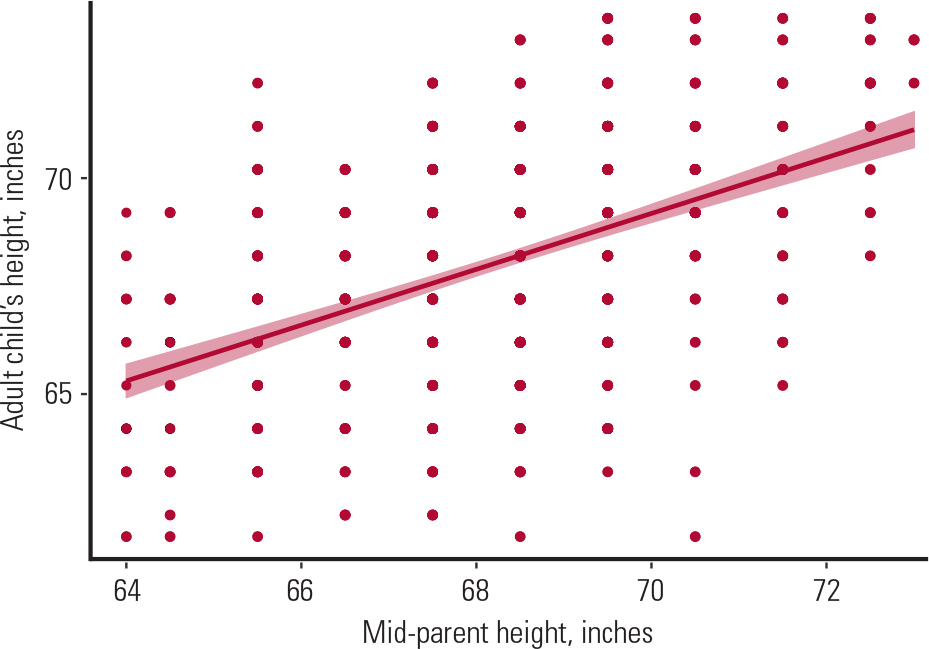
FIG. 4 Scatter plot showing the association of heights between 205 couples (mother and father) and their 928 adult children. The mid-parent height is the average of the heights of the mother and father (Reference GaltonGalton 1886).
To calculate the strength of this association, we would use Pearson's correlation coefficient because (a) heights for both groups are normally distributed (and the sample is >100), (b) the variances are equal (Pearson's correlation coefficient is robust against this assumption when the sample is large enough) and (c) both variables are independent.
Using Pearson's formula on Galton's data, I found a correlation coefficient of 0.43, suggesting a moderate association between the heights of the two groups. This association, however, was statistically significant, with a corresponding P-value of less than 0.05.
Another use of Pearson's correlation coefficient is to explain variability in one variable by that in another. For instance, to calculate the variability in the children's heights explained by the mid-parent height, we square the Pearson's correlation coefficient to get the coefficient of determination, R-squared (R 2). In our example, squaring the 0.43 gives us 0.18 or 18%, suggesting that 18% of the variability in the children's heights is explained by the mid-parent heights. This leaves 82% of the remaining variability explained by factors other than the mid-parent heights.
Box 4 gives key points on correlation.
BOX 4 Correlation
-
Correlation measures the strength of a linear association between two variables
-
Pearson's correlation coefficient (r) is a measure of strength of the association between two normally distributed variables
-
Pearson's correlation coefficient squared gives us the R-squared that measures the proportion of variability in one variable explained by the other
-
Spearman's correlation coefficient (ρ or r s) is a measure of the strength of the association between two non-normally distributed variables
-
A correlation coefficient greater than 0.7 suggests a strong association. A correlation coefficient close to zero suggests no association
-
A positive correlation coefficient suggests a positive association, i.e. both outcome and predictor move in the same direction
-
A negative correlation coefficient suggests a negative association, i.e. outcome and predictor move in opposite directions
-
A scatter plot with a straight line superimposed is used to explore visually the linear association between two variables
Regression
Another way to assess the association between two or more variables is with regression. There are two types of regression: (a) simple linear regression and (b) multiple linear regression. The former refers to the association between two variables, whereas the latter refers to the association between more than two variables.
Simple linear regression
Simple linear regression is very similar to the correlation described above. In the case of correlation, however, we do not distinguish which of the two variables is the dependent and which the independent variable. Since regression is eventually used for prediction, we define one variable to be the dependent (or outcome) variable and the other one to be the independent (or predictor) variable.
Simple linear regression makes the following assumptions:
-
the relationship between the outcome and the predictor is linear
-
the outcome is normally distributed
-
the outcome has the same variance across all values of the predictor
-
outcome and predictor variables are drawn from independent samples.
In the Galton example, to predict a child's height given the mid-parent height, we could do a simple linear regression, with the child's height as the dependent (or outcome) variable and the mid-parent height as the independent (or predictor) variable. The linear regression model is robust against the normality and equal variance assumption for large enough samples, and also both variables are independent, so we would fit a linear regression line (as shown in Fig. 4) to explain the association between the two variables. To express this relationship mathematically, the derived equation from fitting the model would be:
where 24 is the intercept, i.e. the average child's height if the mid-parent height is zero (as this is not possible, this value is just the average child's height in our sample); 0.64 is the regression coefficient beta (b), i.e. the slope of the regression line. The slope represents the steepness of the line: in this case by how much the child's height would change if the mid-parent height were to increase by 1 inch. For Galton's data, the beta coefficient is statistically significant (P <0.05), suggesting that there was indeed a linear relationship between the two variables.
To test the assumptions of the linear regression, we would do a residual analysis that involves plotting:
-
a histogram of the residuals, to check the normality assumption (Fig. 5)
-
a scatter plot of the residuals against the predictor, to check the homogeneity of variance and the independence assumption (Fig. 6).
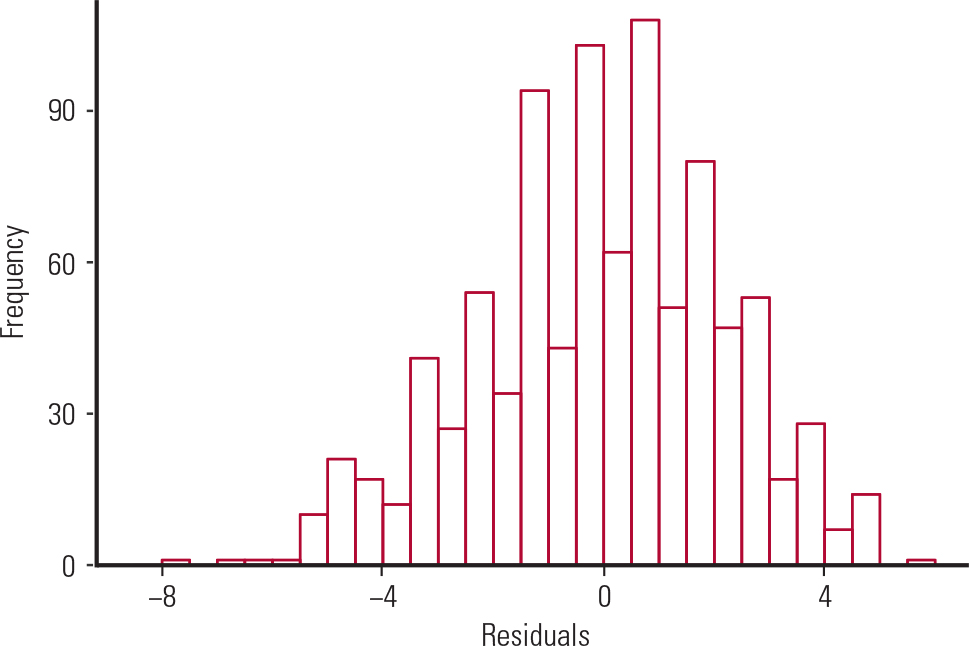
FIG. 5 Histogram of the residuals from Galton's data.
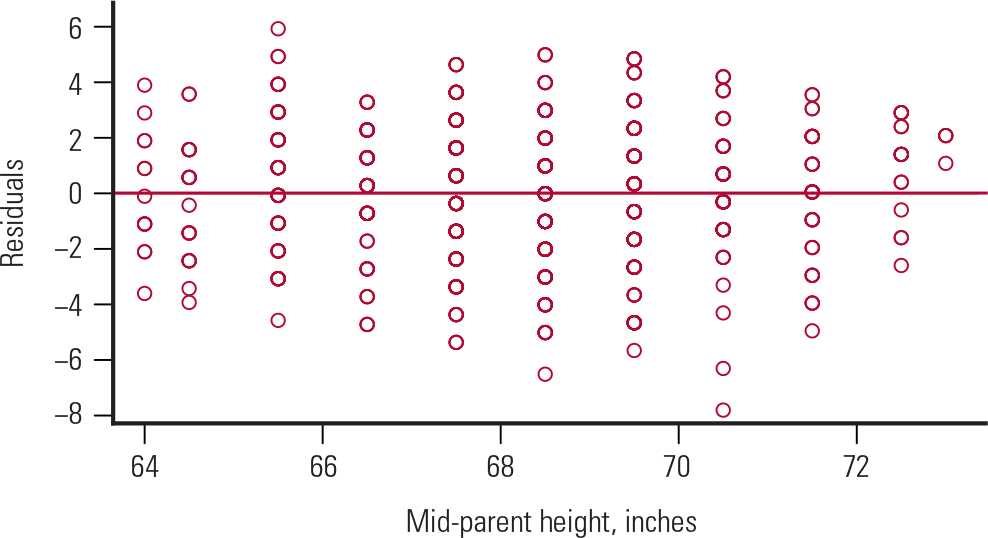
FIG. 6 Residuals v. the predictor (mid-parent height) from Galton's data. The mid-parent height is the average of the heights of the mother and father.
Figure 5 shows a bell-shaped histogram of the residuals, suggesting that the normality assumption of the linear regression model is justified. Figure 6 shows that the residuals are randomly scattered around zero, suggesting that the variance is constant across all values of the predictor. This satisfies the homogeneity of variance and independence assumptions.
Multiple linear regression
The analysis using a simple linear regression model is known as univariate analysis, whereas the respective analysis for multiple linear regression is known as multivariate analysis. Multiple linear regression allows us to add more than one predictor into the regression equation. Hence, a multivariate regression analysis involves:
-
controlling for confounder variables
-
improving the precision of the estimates
-
checking for interaction between the predictors (by adding an interaction term in the regression equation; for example, the addition of an age × gender interaction term in the regression model will show whether the SATQ score changes for males and females across different age groups).
Say, for instance, that we want to see whether the SATV (verbal) score is a significant predictor of the SATQ (quantitative) score in the SAPA project. Table 2 shows the results of the univariate analysis between these two variables.
TABLE 2 Univariate association between SATQ score and SATV score
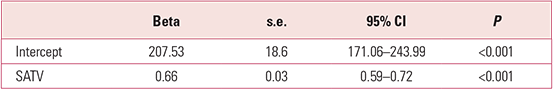
The univariate analysis suggests that the SATQ score changes by 0.66 units per unit increase in the SATV score, and this association is statistically significant. We will now add age into the model to see whether age confounds this association. As can be seen from Table 3, taking age into account attenuates the effect of the SATQ score by only 1.5%, from 0.66 to 0.65. As a rule of thumb, a variable is a confounder if it changes the outcome variable by more than 10%, regardless of its significance. This is not the case in our example, so age is not a confounder. Also, the R-squared from the univariate regression is 0.415 or 41.5%, whereas the adjusted R-squared from the multivariate regression is 0.413 or 41.3%, suggesting that adding age into the model does not explain any more of the variability in the outcome than is explained by the SATV alone.
TABLE 3 Multivariate association of age and SATV score with SATQ score

Similarly, a residual analysis shows that (a) the residuals of the multivariate regression are normally distributed (Fig. 7) and (b) the homogeneity of variance and independence of variables hold for age but not for SATV score, as there seems to be a reduction in variance with increased SATV score (Fig. 8).
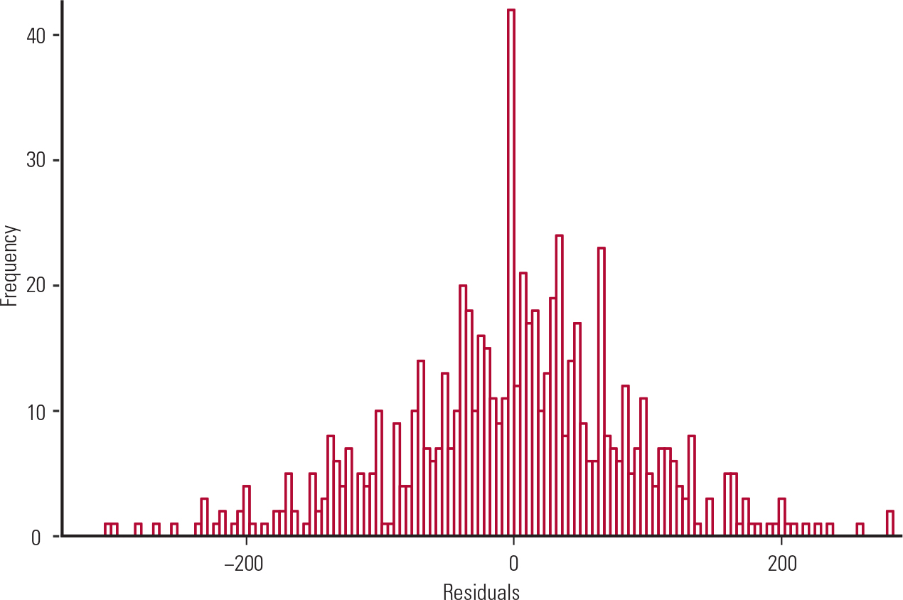
FIG. 7 Histogram of the residuals (from the data in Table 3).

FIG. 8 Residuals v. linear predictors (from the data in Table 3); SATV, self-assessment SAT Verbal test.
Box 5 summarises key points on regression.
BOX 5 Regression
-
Simple linear regression is used to assess the association between two variables
-
Multiple linear regression is used to assess the association between more than two variables
-
Univariate analysis involves the testing of a hypothesis using a simple linear regression
-
Multivariate analysis involves the use of a multiple linear regression in order to control for confounders, improve the precision of the estimates and check for interactions
-
The regression coefficient beta is the slope (or steepness) of the regression line; it shows the change in the outcome per unit increase in the predictor
-
A 95% confidence interval is a range of all plausible values within which the true population value would lie 95% of the time
-
A residual analysis tests the assumptions of the linear regression. It involves the use of a histogram of the residuals for testing the assumption of normality and a scatter plot of the residuals against each predictor for testing the equal variance and independent variables assumptions
-
The P-value tests the hypothesis of linear association between the outcome and the predictor. A P-value less than 0.05 would suggest a statistically significant linear association between the predictor and the outcome
Principal components analysis
The purpose of principal components analysis (PCA) is to make a data-set with a large number of variables smaller without losing much information. The derived new variables are called principal components; they are linear combinations of the original variables and explain most of the variation in the data. PCA is usually done before the regression or for exploratory purposes to aid in understanding the data or in identifying patterns in the data.
As an example, we can consider a data-set with 50 observations and four variables. These four variables represent statistics on arrests per 100 000 residents for (a) assault, (b) murder and (c) rape in 50 US states in 1973 and (d) the percentage of the population living in urban areas (Reference McNeilMcNeil 1977). If we wanted to summarise these data using fewer than four variables, we would do a PCA to find the number of principal components (i.e. linear combinations of the original four variables) explaining most of the variability in the data.
Figure 9 shows a scree plot (on the left) that I created to find the number of principal components needed to explain the most variation in the data. Plot (b) shows the cumulative proportion of variance explained by the four principal components in the data. As can be seen from Fig. 9, the first component alone explains 62% of the variation in the data; the second component explains another 25%, the third component about 9% and the fourth component about 4%. An ‘elbow’ shape on a scree plot indicates the number of principal components needed to summarise the data. In this example, the crook of the elbow is on the second component, suggesting that we discard all components after the point at which the crook starts.
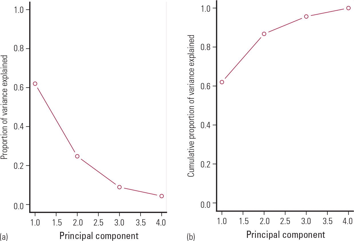
FIG. 9 Scree plots showing (a) the proportion of variance explained by each of the four principal components and (b) cumulative proportion of variance explained. Data from Reference McNeilMcNeil (1977).
Hence, the first two components together explain 87% of the variation in the data, suggesting that we reduced the dimensionality of the data from four to two independent variables. Table 4 shows the resulting two new variables (principal components PC1 and PC2). Each new variable is the weighted sum of the original four variables.
TABLE 4 Results of the principal components analysis showing the weights of each variable

In Table 4, the weights, which can range from −1 to +1, indicate the relative contribution of each variable to each component. For example, murder, assault and rape have weights of 0.54, 0.58 and 0.54 respectively for the first component, whereas proportion of the population living in urban areas (urban proportion) has a weight of 0.28 for this component. These data suggest that PC1 is a measure of violence.
The second component (PC2) has high weights for urban proportion (0.87) and murder (−0.42) and lower weights for assault (−0.19) and rape (0.17). Thus, these data suggest that PC2 is a measure of urban criminality.
The advantage of PCA is that we can do a multiple regression with only two variables (PC1 and PC2) instead of four. This makes it easier to interpret the results, reduces the risk of chance findings and makes the results more robust, since a composite variable may capture better a particular trait (e.g. violence) than the original variables.
Box 6 summarises key points on principal components and PCA.
BOX 6 Principal components and principal components analysis
-
Principal components analysis is a method of reducing the dimensionality of data
-
The principal components are linear combinations of the original variables that explain the most variation in the data
-
A scree plot is used for identifying the number of principal components
-
Principal components are composite variables that aid the interpretation and robustness of the results
Statistical software
I produced all the figures and analyses in this article using R version 3.0.2 statistical software. R is an open source (free) software that is widely used by universities worldwide. R is accompanied by a popular and powerful graphical user interface (GUI) called Deducer, which allows users to perform statistical analyses and graphing functions without any coding. Users should first download and install R (from www.r-project.org) and then download and install Deducer (from www.deducer.org).
Conclusions
I hope that this article will help psychiatrists to understand the basic principles of the statistical analysis of data with continuous outcomes. It should equip them with the ability to determine what statistical tests to use for comparing two or more groups, how to interpret correlation and regression, and what statistical techniques are required to reduce the dimensionality of the data.
MCQs
Select the single best option for each question stem
-
1 Which of the following statistics should be used to summarise normally distributed variables?
-
a Mean and standard deviation
-
b Median and interquartile range
-
c Frequencies and percentages
-
d Both a and b
-
e Both a and c.
-
-
2 A large cohort study is carried out to assess the efficacy of an experimental drug in reducing depression score when compared with placebo. What test should be carried out to assess the efficacy of the drug before and after the intervention?
-
a t-test
-
b Wilcoxon rank-sum test
-
c Paired t-test
-
d Repeated-measures ANOVA
-
e Wilcoxon signed-rank test.
-
-
3 A large observational study is carried out to assess the risk factors for schizophrenia. Which type of analysis should be used to identify statistically significant risk factors?
-
a Univariate analysis
-
b Correlation
-
c Multivariate analysis
-
d Both a and c
-
e Both b and c.
-
-
4 A large randomised clinical trial is carried out to assess the efficacy of an experimental drug in reducing depression score when compared with placebo. The trial consists of a baseline assessment and 6-month and 12-month post-baseline assessments. What type of test should be used to compare the change from baseline to 6 and 12 months post-baseline between treatment and placebo?
-
a T-test
-
b Wilcoxon rank-sum test
-
c Repeated-measures ANOVA
-
d Multiple linear regression
-
e Both a and c
-
-
5 We have a large data-set of responses to a health assessment questionnaire consisting of 20 questions. We would like to devise a shorter version that would provide the same information as the original. Which of the following analyses would it be best to use to on the data to achieve this?
-
a Principal components analysis
-
b Multiple regression
-
c Simple regression
-
d Correlation
-
e All of the above.
-
MCQ answers
| 1 | a | 2 | c | 3 | d | 4 | c | 5 | a |


eLetters
No eLetters have been published for this article.